Perfume Photography: Light, Glass and Mood
Perfume photography for brands: light the glass, keep the juice color true and the label readable. See how we build fragrance images from your own photos.
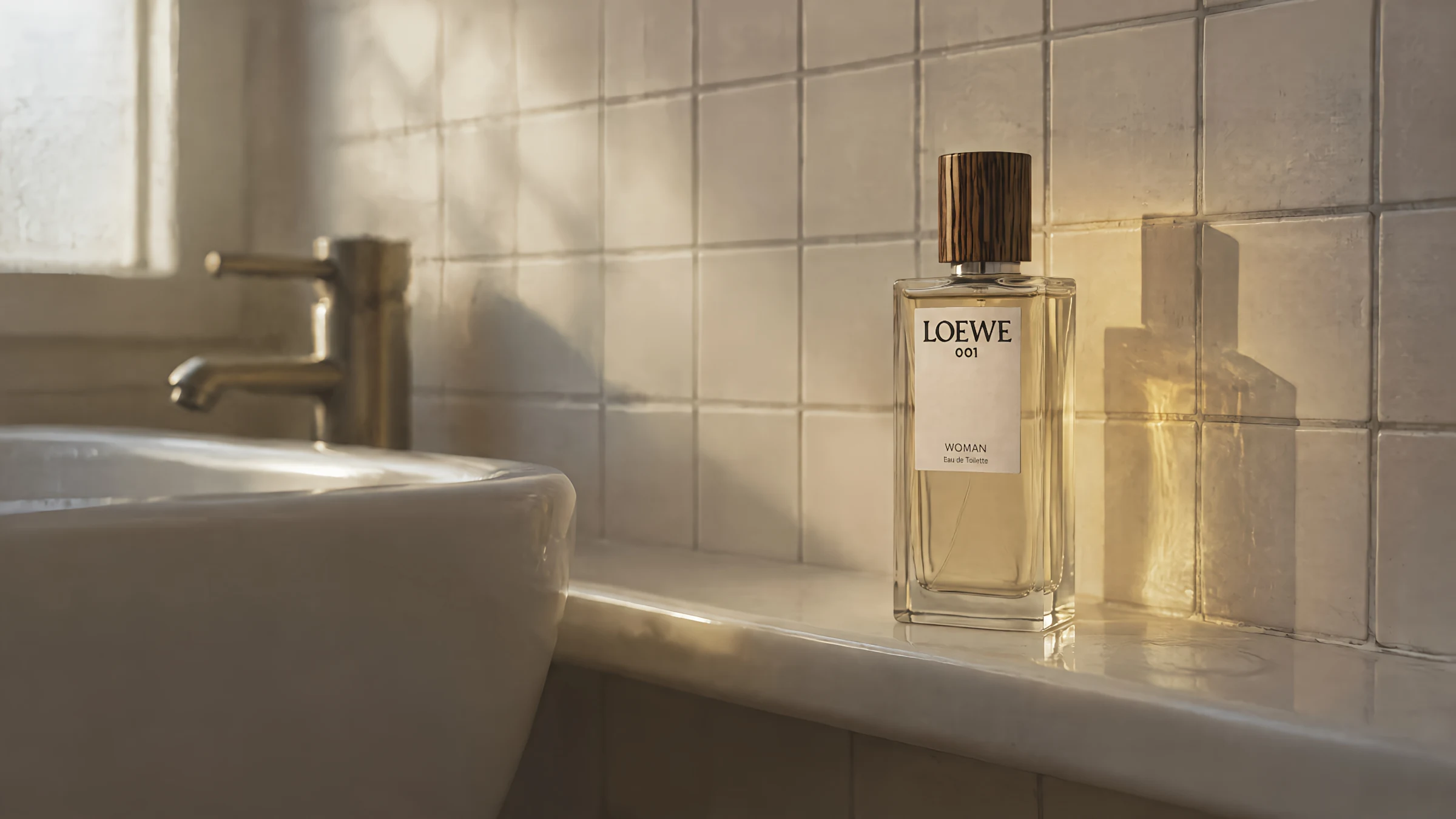
Perfume photography is lighting 3 things at once: the glass, the liquid and the label. Most guides skip all 3 and start with mood.
We build fragrance visuals for luxury brands from their own product photos, and mood is the last thing we check. Get those right and the mood has something to stand on. Get them wrong and no amount of dried orange slices will save it.
The mood-first guides have a point. Fragrance is the one product a photo can’t show directly, so feeling is most of what you’re selling. But a feeling built on a muddy bottle reads as a cheap bottle with good intentions.
Why perfume photography is harder than it looks
Perfume bottle photography starts from one awkward fact: the bottle is a mirror with a price tag. It reflects the room, the lights, the photographer and the window behind them.
Every bottle is also 3 subjects:
- The glass, which shows every light source as a hard white streak.
- The liquid, which only shows its color when light passes through it.
- The label, which is flat, small and usually printed on a curve.
Each one wants different light. Front light flatters the label and kills the glass. Back light shows off the liquid and turns the label into a silhouette.
So give every light one of those jobs, and decide which before you switch it on.
How to light a perfume bottle
Start behind the bottle.
A large soft light behind and slightly above the bottle does 2 jobs. It shows the liquid’s color, and it gives the glass one clean, even glow. Garry Belinsky’s 2022 piece for Adorama on glass photography makes the same point: with the light behind the glass, reflections are far easier to avoid.
Then shape the edges. Strips of black card just outside the frame, on both sides, draw a dark line down the edges of the glass. That line is what tells the eye where the bottle ends. Ian Pack’s 2024 guide for Amateur Photographer on photographing bottles and glass walks through the same setup with diagrams.
Only now add light for the label. A small, soft source from the front and slightly to one side, kept low in power, is usually enough.
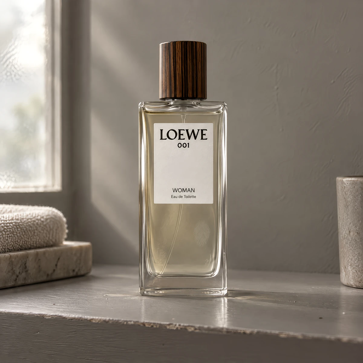
Every reflection you leave on the glass is a debt. The retoucher pays it later, by hand, on every image in the set.
Perfume photography at home
A perfume bottle photoshoot at home follows the same logic, on a table by a window. Put the bottle between you and the window so the daylight comes through the liquid. Use 2 pieces of black card at the edges. Bounce a white card back at the label.
The window does the job of the large soft light. The card does the rest.
Keep the liquid color true
The color of the juice is product information. A buyer who can’t smell anything is reading that color as a clue.
It shifts easily. Warm tungsten light pushes it amber and a cold screen pushes it gray. A heavy grade in editing can change it completely, and nobody notices until a customer holds the real bottle next to their phone.
Check it the plain way. Hold the real bottle in daylight next to your screen and compare. If they don’t match, the photo is wrong, however good it looks.
Keep the label readable
The name on the bottle is the brand. In most perfume photos it is the least readable thing in the frame.
The usual causes:
- A reflection sitting across the logo.
- A shallow focus that softens the type on the curve.
Worst of all is a dark label on dark glass, against a dark background. Cologne in smoked glass is the usual victim.
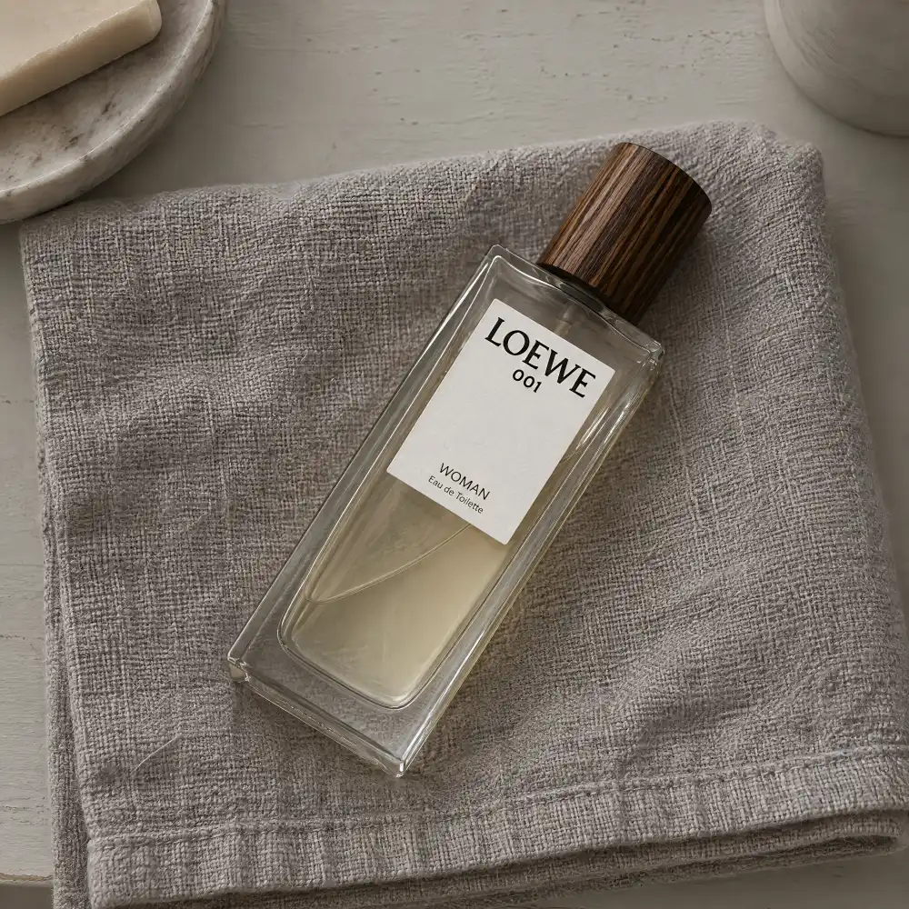
Here is a test you can run right now. Open your best-selling fragrance on your phone, on the category page, at thumbnail size. Can you read the name? Can you see the color of the liquid? If not, the image is working as a mood board.
Perfume photography background
The background has 2 possible jobs, and they rarely mix well.
On a product page, it should get out of the way. A plain light or mid-tone surface lets the dark edges of the glass show. Pure black behind dark glass is the classic mistake (the bottle simply leaves the photo).
In a campaign image, the background is where the scent lives. People buy a fragrance for the evening they imagine wearing it, and the setting is the only place a photo can suggest that evening.
You can see how differently that plays out across a month of imagery in our work.
That’s why putting the notes on the table, a lemon for citrus and a rose for rose, tends to read flat. It describes the scent and stops there.
Perfume photography with a model
A model solves 2 problems a bottle alone can’t.
The first is size. Perfume bottles are hard to judge on a white background. A hand around the bottle settles it in one frame.
The second is the moment. A wrist, or a coat being put on. The bottle doesn’t have to be in the shot at all for the image to sell it.
None of this needs the bottle itself to be generated. The model and the moment can be built around the real one, which is how every service we offer works.
Perfume product photography ideas
Some ideas hold up better than others. The best ones come from the glass itself.
Colored shadows
Light passing through colored liquid throws a colored shadow. Place the light low and to the side, and the shadow on the surface becomes part of the composition. It shows the liquid’s color twice.
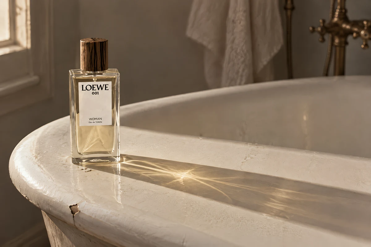
The atomizer close-up
The collar and the spray mechanism are where the bottle shows its build quality. A tight macro on the metal and glass meeting is the image that justifies the price.
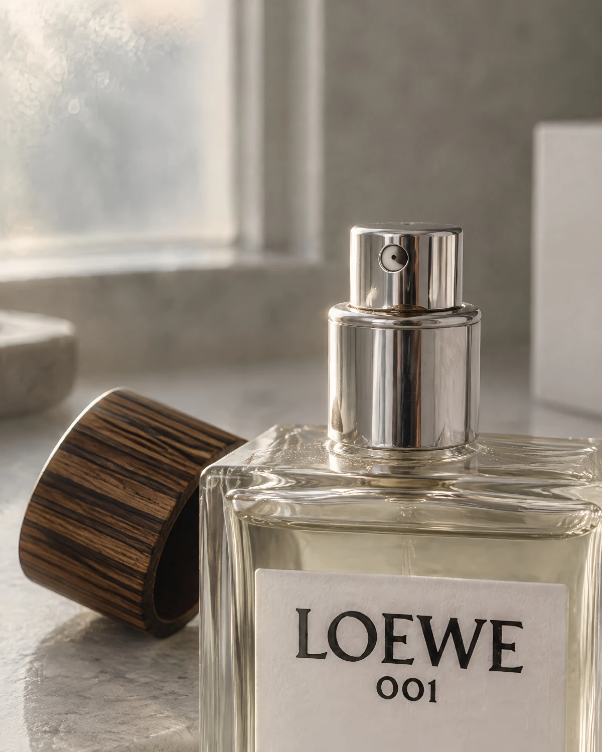
The dressing table moment
Perfume still life photography works best with a life in it: the bottle among the things it actually lives with, like a hairbrush and the edge of a mirror. One real setting does more than a sculpted plinth.
Water and reflections
A shallow tray of water or a sheet of glass under the bottle doubles it. It works. It’s also everywhere, so it needs a reason beyond looking nice.
Product page shots vs perfume advertising photography
A fragrance launch needs both, and they are different jobs.
The product page needs the clean bottle, the liquid color readable, the label readable, a scale shot and the atomizer close-up. These answer what the buyer is getting.
The campaign needs one image with an idea in it. It answers why anyone would want to smell like that.
Most brands shoot the first set well and treat the second as decoration. It isn’t decoration. It’s the only image that sells the scent instead of the bottle.
Shooting a whole range so it reads as one house
One beautiful bottle photo is easy. A full range that looks like it comes from one house is the real work.
Fix the light direction, the background tone, the camera height and the lens across the range. Let the liquid color and the label change, because those are the products. Everything else stays the same.
A range shot under a different lighting setup per bottle reads as several brands sharing a shelf.
If you’re weighing up a month of this, see our monthly pricing.
Backlight, black card, a label fill, a color check, then a whole range held in one light: that’s the job this post describes. Skip it. Send us the photo that failed the thumbnail test, phone shot and all. The bottle stays exactly yours. We build the scene around it. We can build one image for you at no cost.
Hypervision. Glass, read correctly.
Questions people ask
How do you take a photo of perfume?
Light the bottle from behind and from the sides, with black card at the edges to draw the outline of the glass. Then check two things: the liquid color against the real bottle in daylight, and the label at thumbnail size.
What background is best for perfume photography?
For a product page, a plain light or mid-tone background that lets the glass edges show. For campaign images, a setting that carries the idea of the scent. Avoid dark backgrounds on dark glass, where the outline disappears.
Do perfume photos need a model?
The main product image works best as a clean bottle shot. A hand holding the bottle is the simplest way to show size, and a worn moment is what campaign images are for.
How do you photograph perfume at home?
Put the bottle between you and a window so daylight passes through the liquid. Hold black card at both edges of the bottle and bounce a white card back at the label. A phone on a small tripod is enough for a usable product image.
How do you make perfume photos look luxurious?
Control the reflections and give the light one clear direction. Luxury reads as decisions: a single setting, and nothing on the glass that wasn't meant to be there.
